As part of my running 2022 resolution, I’m pushing the boundaries of the music I listen to. To do this, I’ve been using Discogs to randomly recommend me music and if the album art looks interesting, I find it on Spotify and see how it works out.

Il manuale del piccolo esploratore by Italian Artista Bruno Lauzi was that perfect middle of intregue and surprising results. Bruno Lauzi was an Italian singer-songwriter ranging various genres from Pop, Jazz, World Music and more. He had a lengthly career spanning 1961 until his death in 2006. From having an unsuccessful political career with the Italian Liberal Party to being a fan of U.C. Sampdoria, let’s just say his music career is what he is most famous for.
In Italy, Lauzi is most known for tracks like “Ritornerai” (1963), “Amore caro amore bello” (1972), “Onda su onda” (1974), and other classics that came out of his prime. Il manuale del piccolo esploratore was released in 2003, the 5th to the last album before his passing and one of the last to get any critical interest from the italian scene. Still, he was an icon for those who loved him and with 45 years and 32 albums, he had plenty of fans.

So why write about Il manuale del piccolo esploratore to an audience of readers who are interested in Vaporwave, internet culture and all things nostalgic? Aesthetic of course!
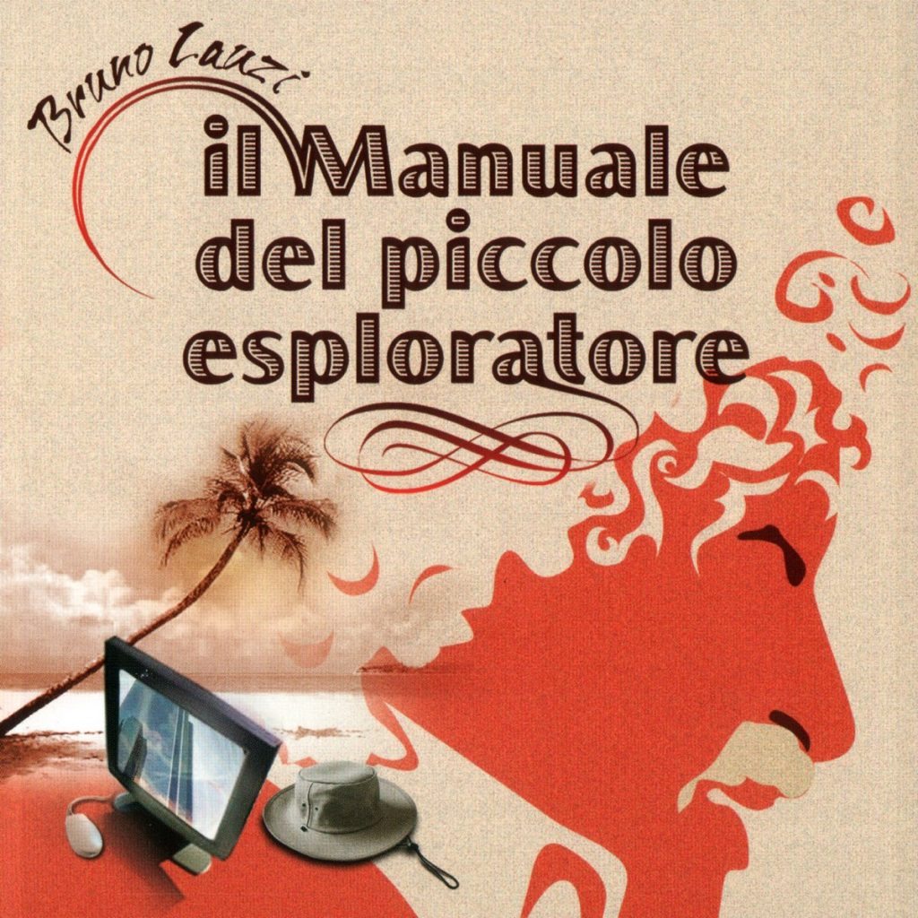
Take a look at the album art and you’re immediately drawn into wild speculation of what this album is going to sound like. You are either going to notice two major design points; the album font or the Marxist like side portrait silhouette of Bruno Lauzi himself. If you start to take a deeper look, you’ll start to notice my initial draw… the font (of course).
Nothing say’s an albums name like putting the album name on the cover art, standard stuff. The font design of the actual album is remenisent of woodcut printing, with bold thick letters and shading cuts for an old-style fill. But from the second word, manuale or manual, we get a wicked arching sun-like shape growing from the left in a fading brown wood to the prominent Marxist red. Following the same path, Bruno Lauzi’s name is added.
One might think, this must be a tropical-politico album with the bright futures and relaxing wooded details since I know you already took a peak at the palm tree below it but is it? Let’s investigate the translation of the album name first; Il manuale del piccolo esploratore or The little explorer’s handbook. Oh?! Then adventure music mixed with a little world domination you little Liberal Party member… Admirable for 69 year old musician!
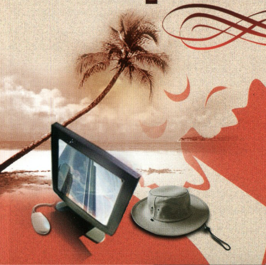
but wait what’s that in the bottom left corner? No not that explorer hat, that old Y2K (oddly thin for the time) computer monitor? and on that monitor… a city scape? Thanks for added the mouse to confirm one thing… This is a low-key electronic vapor album with certain values!
Well it’s actually not. It’s kind of world-musicy but mainly just italian pop ballads with one or two catchy hooks. Still, the cover art deserves an honorary introduction to the vaporwave hall-of-fame.
It’s hard to say what the idea behind the aesthetic was besides an older generation entering a new millennium and documenting what the future was bringing. Really, deep down, I think he knew we’d all be exploring virtual cities with plots of land worth $50k from the comfort of our computers and italian communism will rise up again to defeat the looming doom of NFTs. But maybe my italian is just rusty and I misinterpreted the lyrics…
PS. This is satire. nft-less